|
|
MapEcos was a
collaborative website designed to provide an
evenhanded view of industrial environmental
performance -- particularly pollution -- and
the steps facilities are taking to limit their environmental
impacts and benefit their
stakeholders.
The site went online in the
October of 2007 and continued in operation
till October of 2011.
Eventually, the cost of maintaining the
server forced us to close it down.
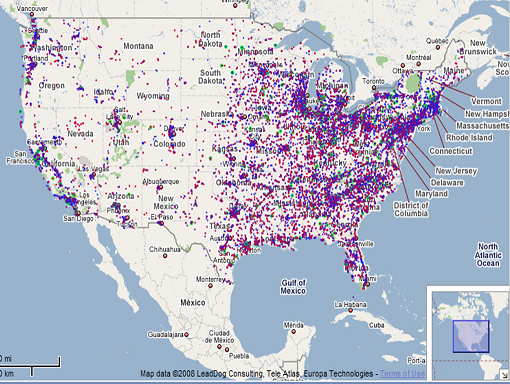
The site provided data about
the emissions from every site reporting
toxic release emissions to the US
Environmental Protection Agency. Over
23,000 facilities were shown on the
map. We invited managers from
each facility to post information on their
efforts to protect the environment.
About 1000 managers provided us with some
information about their facility's
efforts. Approximately 300 allowed us
to post some of this information to the
map.
The facilities are color coded
roughly by their impact. Those that
marked with a redder color have more
emissions or more toxic emissions; those
with a bluer color fewer or less toxic
emissions. For more information on how
we caclulated these effects, please see the
original MapEcos
guidebook.
Some facilities
are marked with green rings. These are
the facilities that voluntarily reported
information to MapEcos about the actions
they were using to reduce their emissions.
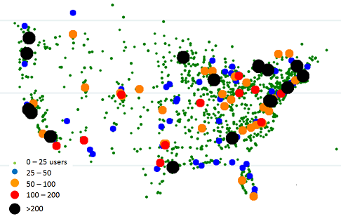
The site was visited by tens
of thousands of people. The following
map shows the location georgraphica
disribution of US users. The number of
users in a 30 mile radius is coded by the
color and
size of the marker.
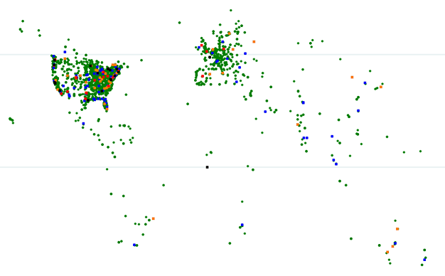
Although MapEcos only coverd
the US, it was used by people around the
world. The map below right shows the
location of these users.
More information
on MapEcos can be found at HBS
working knowledge, FT.Com,
and the Economist.
|
|
|